

Brand · Web Design
T'adore.A salon-clinic,quietly luxe.
A hair, beauty and aesthetics salon-clinic in London — we built an editorial, feminine identity around a fine-line lotus and a high-contrast serif, and a calm, photography-led website that makes a personalised, luxe experience feel like the only kind of experience worth having.
01 / The Brief
Hair, beauty,aesthetics —one quiet world.
T'adore is a salon-clinic combining hair, beauty and aesthetics under one roof in London. Their pitch is straightforward: the same care, the same hands, across the things you'd normally have to book at three different places. The brand had to feel personal and luxe, more like an editorial than a salon flyer — calm, confident, and a little bit indulgent.
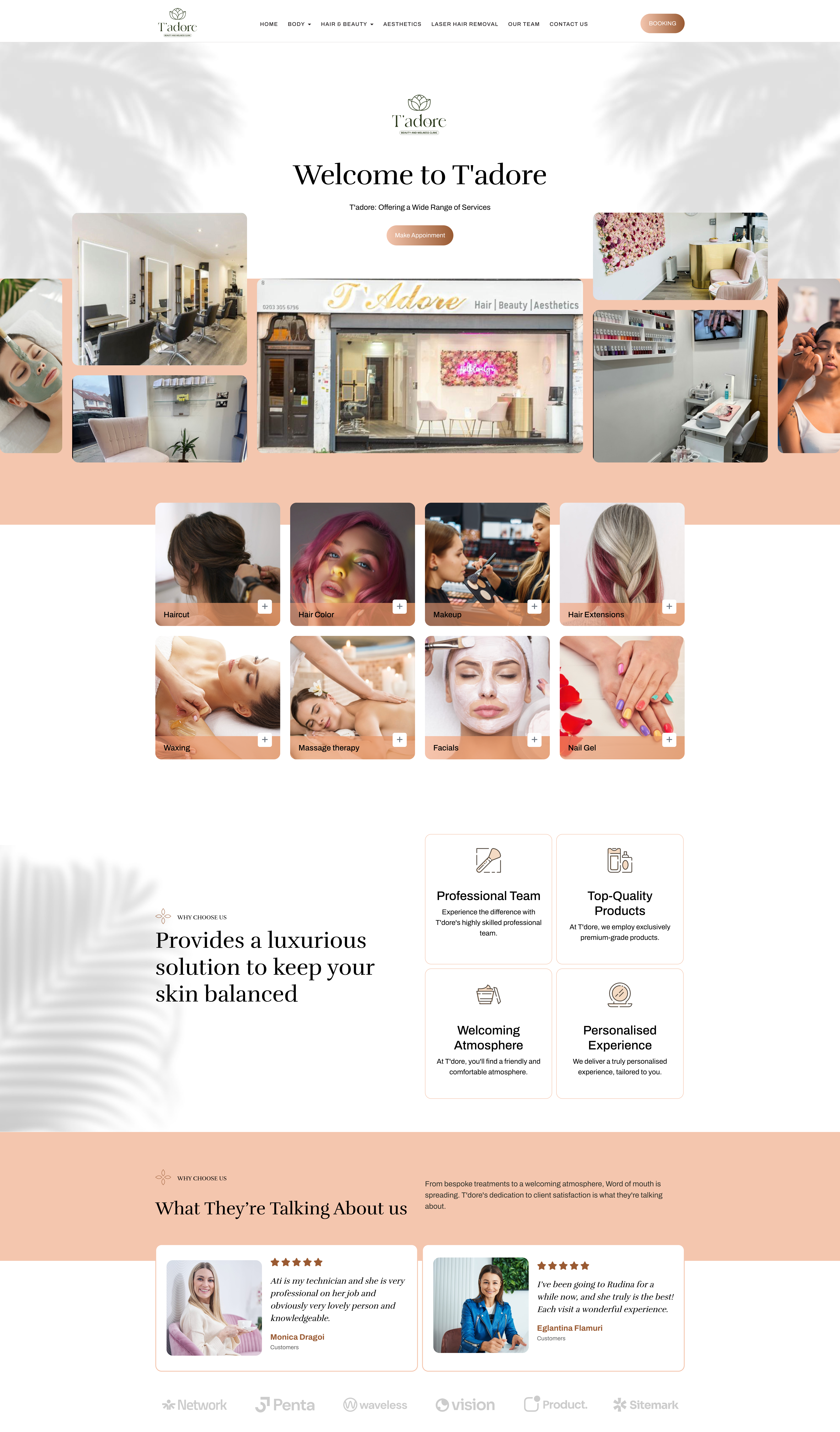
We built an editorial identity around a fine-line lotus, a high-contrast display serif and a soft palm-shadow motif — and a calm, photography-led website that lets the rooms, the team and the treatments speak. Booking is one warm caramel-tan tap away.

03 / Palette
Sage, blush,caramel, ivory.
A grown-up editorial palette tuned for hair, beauty and aesthetics. Deep sage gives the brand its calm, considered backbone; a soft blush peach warms the service cards; a single caramel tan does all the work on the calls to action; ivory keeps the rest airy and editorial — the kind of room you'd happily sit in for an hour.
Mark & headings
Service-card overlays
Booking CTAs
Base & cards
04 / Website
A calm room,online.
An airy ivory site with soft palm-shadow overlays, a centred serif welcome, a clinic-and-salon photography grid, peach service cards for the full menu — haircut, hair colour, makeup, extensions, waxing, massage, facials, nails — and a clear, caramel 'Make Appointment' button that follows the visitor from hero to footer. A luxurious solution, on the page. Live at tadoreclinic.com.
— A note on the work
Luxurious isn'ta treatment —it's the room,the staff and thehalf-hour youspend in the chair.— Studio note
05 / Deliverables
What weshipped.
A focused brand-and-web engagement — identity plus an editorial, conversion-ready website.
- 01Logo system (primary, stacked)
- 02Lotus mark
- 03Clinic descriptor lockup
- 04Colour palette
- 05Typography & UI type scale
- 06Button & CTA system
- 07Service-card components
- 08Photography & palm-shadow motif
- 09Web UI design
- 10Responsive layout
- 11Booking & contact flow
- 12Front-end build