

Brand · Packaging · Apparel · Signage
Slice Joint.Fold it.Own it.
A New-York-style pizza-by-the-slice joint in Dubai — we built a packaging-led brand identity with a slice monogram, a tossed-slice pattern system, and applications from triangular slice boxes to a projecting blade sign over a checkerboard shopfront.
01 / The Brief
A slice shop,distilled intoone shape.
Slice Joint is a New-York-style pizza-by-the-slice shop in Dubai — classic, hand-tossed, fold-and-go. The category is loud and crowded with cartoon mascots and tomato-italic clichés; Slice Joint wanted something cleaner and bolder, a brand that felt like a real New York slice shop transplanted: red awnings, checkerboard floor, no fuss.
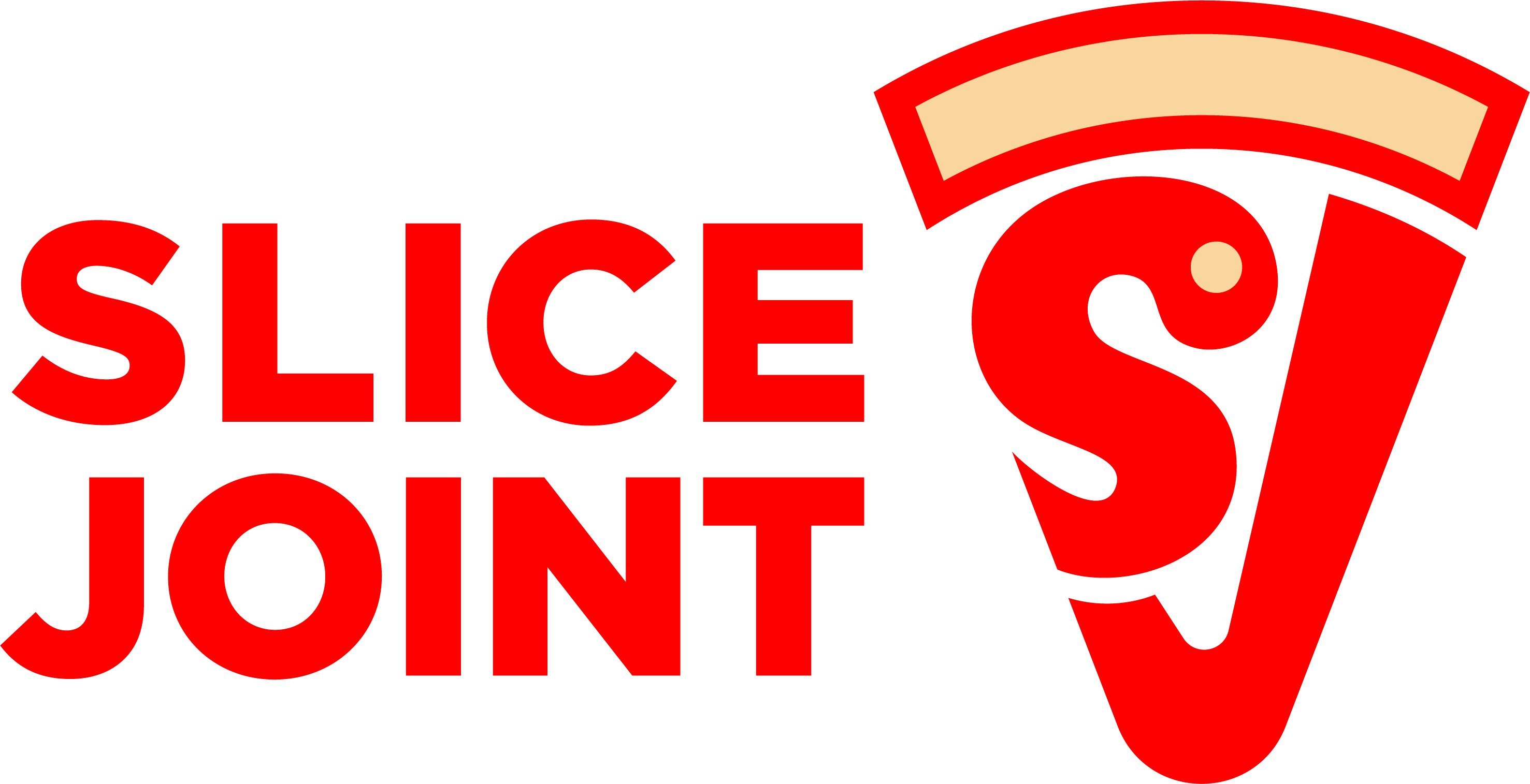
We built a packaging-led identity around an SJ slice monogram — a downward triangle with a wheat-cream crust arc and a pepperoni dot — a tossed-slice pattern system, and an application set that runs from triangular slice boxes to a projecting blade sign over a red checkerboard fascia. Fold it. Own it.
03 / Construction & Lockups
A mark builtto hold upat any scale.
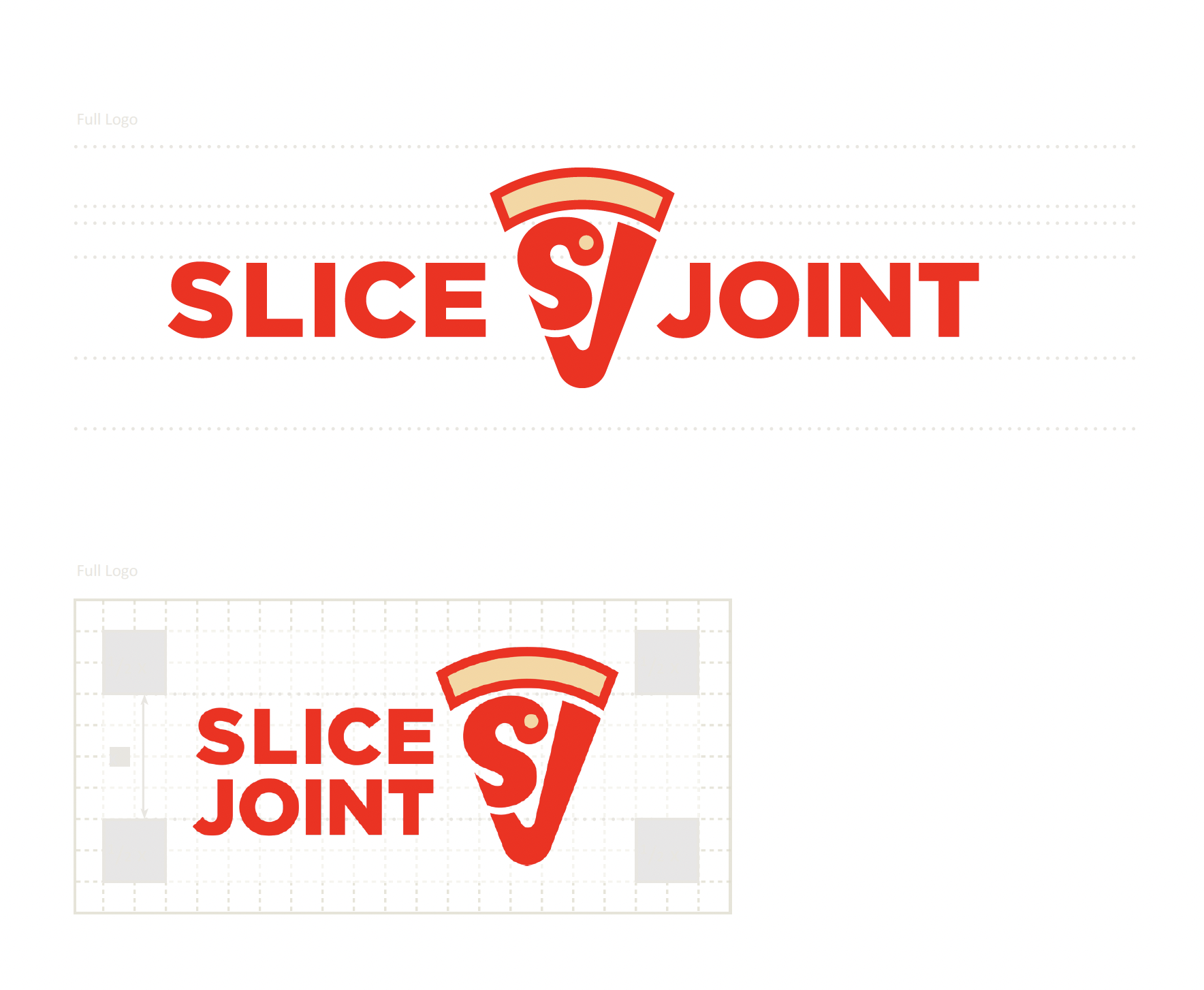
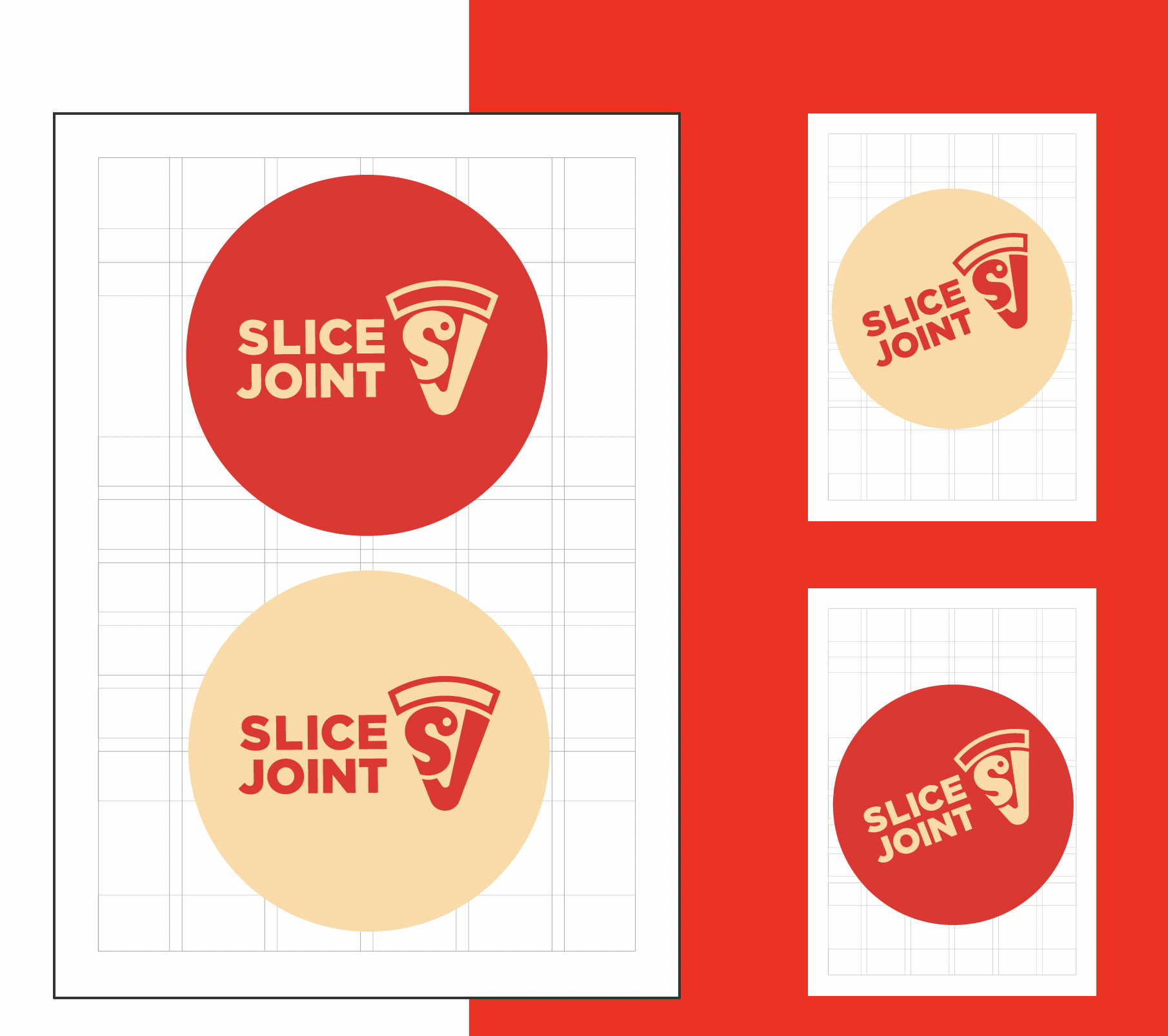
Horizontal and stacked lockups, generous clear space, and a strict construction grid — so the mark reads as cleanly on a five-metre fascia as it does on a paper napkin. The badge variants take the same logic into a circle for stamps, stickers and signage.
04 / Palette
Red, cream,and a blackapron.
The classic slice-shop palette, sharpened. A confident slice red carries the mark and signage; a wheat-cream crust softens the system across packaging and apparel; pure paper white keeps cups, boxes and napkins clean; charcoal anchors the staff aprons and the small print.
The mark & signage
Crust, carriers, wrap
Boxes & cups
Apron & small print
05 / Pattern System
A patterntossed acrossthe brand.
A tossed-slice tile threads through the system — cups, wraps, aprons, fascia. Small enough to read as texture, identifiable enough that a single fragment still says 'Slice Joint'. It does the work that texture has to do on a confident brand: stops the spaces between the big moves from feeling empty.
06 / Packaging
A triangleis the box.
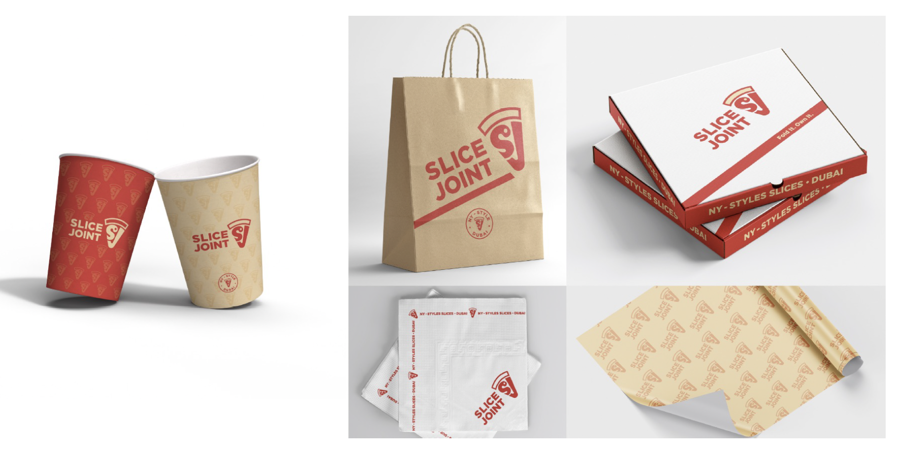
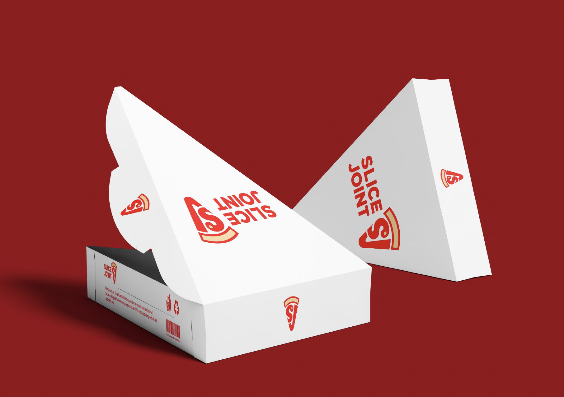
A coordinated packaging system: triangular slice boxes that ARE the slice, flat NY-style pizza boxes printed with 'NY-STYLES SLICES · DUBAI / Fold It. Own It.', hot and cold cups, a kraft carry bag stamped with the round NY-STYLE · DUBAI seal, printed napkins, and cream tissue. Consistent enough to be a system, distinct enough that each piece does its job.
— A note on the work
Fold it.Own it.A brand thatfits in onehand and onemouthful.— Studio note
07 / Ordering Experience
A carrierthat doublesas a poster.
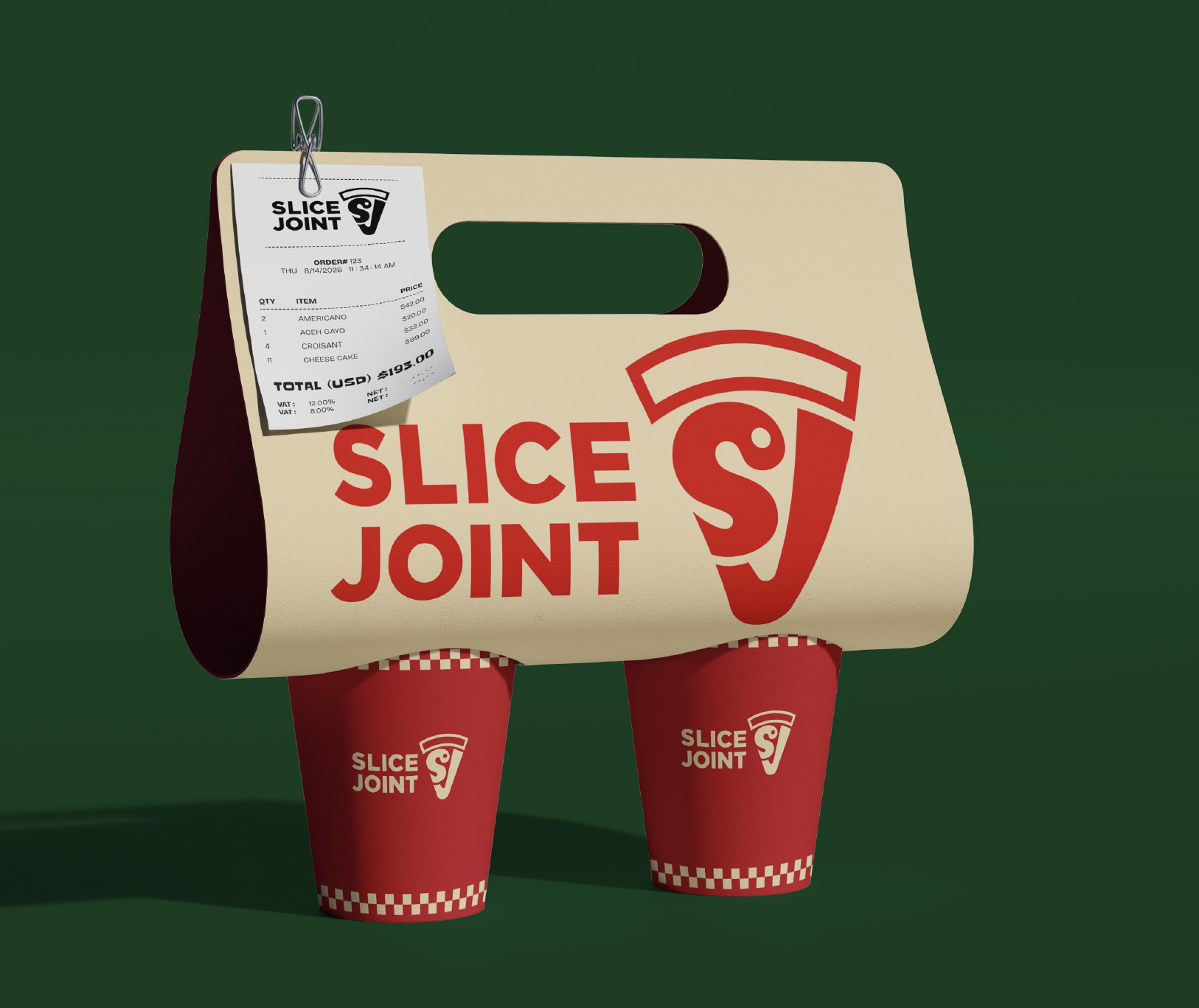
The two-cup carrier is the brand turned into a takeaway moment: oversized SLICE / JOINT type filling the panel, a paper receipt clipped to the handle, and red checkerboard-trim cups slotted underneath. A small operational thing — how you carry two drinks — becomes a piece of identity that walks out of the shop.
08 / Apparel
Crew kit,cut from thesame cloth.
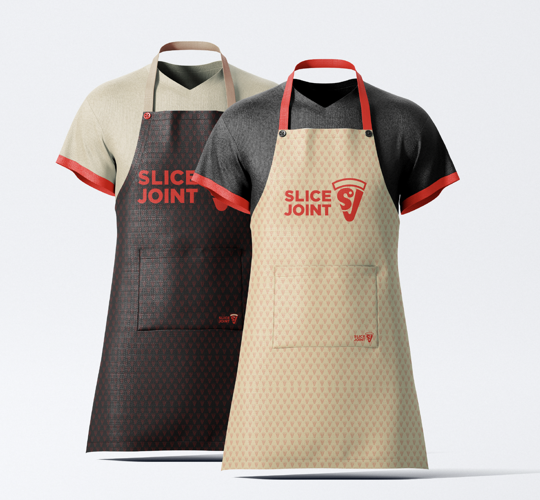
Two aprons — a charcoal one with bold SLICE / JOINT type, a cream one with the lockup over the tossed-slice tile. Red ties and trim tie both back to the mark. Staff become part of the system the moment they step on the line.
09 / Environmental
A blade signand a redshopfront.
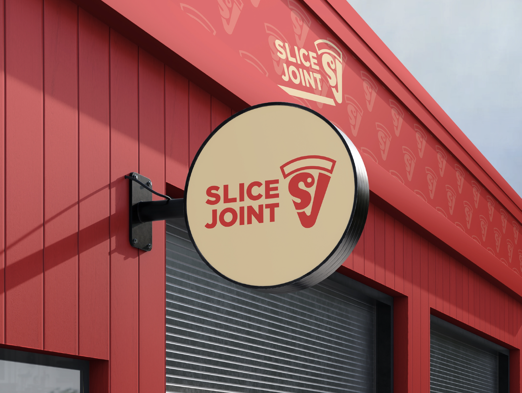
A projecting blade sign — cream face, red logo — mounted on a red shopfront with a patterned slice-tile fascia. From the street, the brand reads in two beats: the sign, then the texture. Even with shutters down, the building is unmistakably Slice Joint.
10 / Deliverables
What weshipped.
A packaging-led brand identity — from logo system to storefront.
- 01Logo system (primary, stacked, horizontal)
- 02SJ slice monogram
- 03Clear-space & construction
- 04Badge / reversed marks
- 05Colour palette
- 06Tossed-slice pattern
- 07Triangular slice boxes
- 08Flat pizza boxes
- 09Hot & cold cups
- 10Two-cup carrier
- 11Receipt / order ticket
- 12Kraft carry bag
- 13Printed napkins
- 14Tissue / wrapping paper
- 15Staff aprons
- 16Projecting blade sign & shopfront fascia