

Brand · Print · Web
Fulham Dental.Quietlyconfident care.
An NHS and private dental practice in Fulham — we built a clean, editorial black-and-white identity, a full stationery system, and a website that makes premium dental care feel calm, modern and reassuringly professional.
01 / The Brief
Dental care,with adesigner's eye.
Fulham Dental Centre offers NHS and private dentistry — cosmetic, general, orthodontic and restorative — led by principal dentist Dr Reza Najafi. In a borough full of practices, they wanted to stand out not by shouting, but by looking unmistakably considered: clean, modern, and quietly premium.
We built an elegant black-and-white identity around a custom 'f' monogram, a coordinated stationery system — business cards, appointment cards — and a crisp, photography-led website. Restraint is the whole strategy: in a category of clip-art and primary colours, monochrome reads as confidence.

03 / Palette
Black, white,and totalrestraint.
No colour, by design. In a category that leans on friendly blues and clip-art smiles, a disciplined black-and-white system reads as premium and self-assured. Just ink, paper and a single grey — and a monogram confident enough to carry it.
Type & mark
Surfaces
Secondary detail
04 / Stationery & Print
A brand youcan hold.
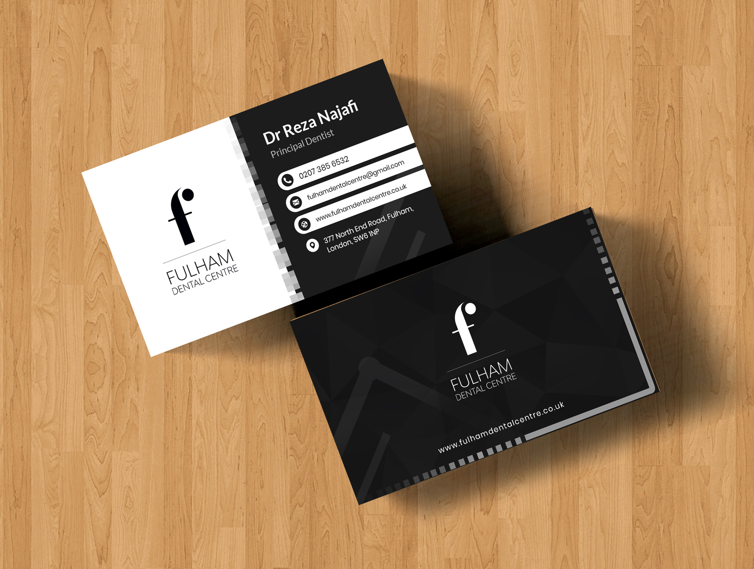
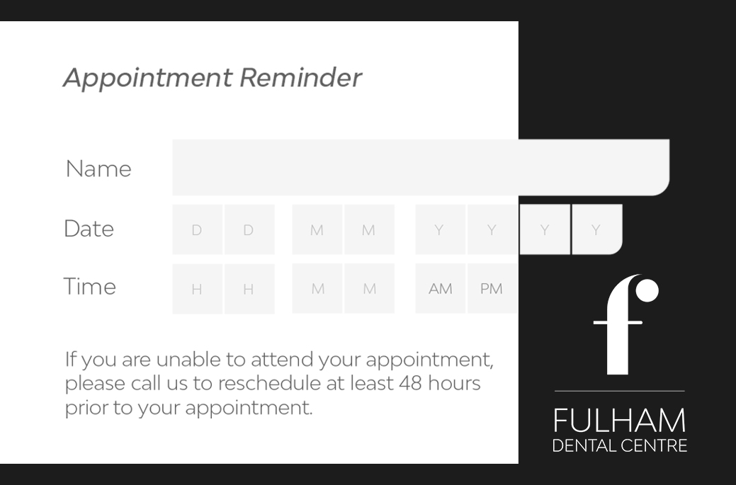
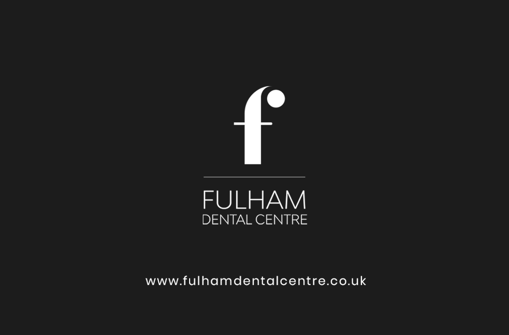
The identity extends into a coordinated print system — business cards that flip from white-on-black to black-on-white, and appointment cards that turn an admin necessity into a brand touchpoint. Considered details that signal a considered practice.
— A note on the work
In a loudcategory, blackand white isn'ta limitation —it's the wholeargument.— Studio note
05 / Website
Calm, clean,clinical —in a good way.
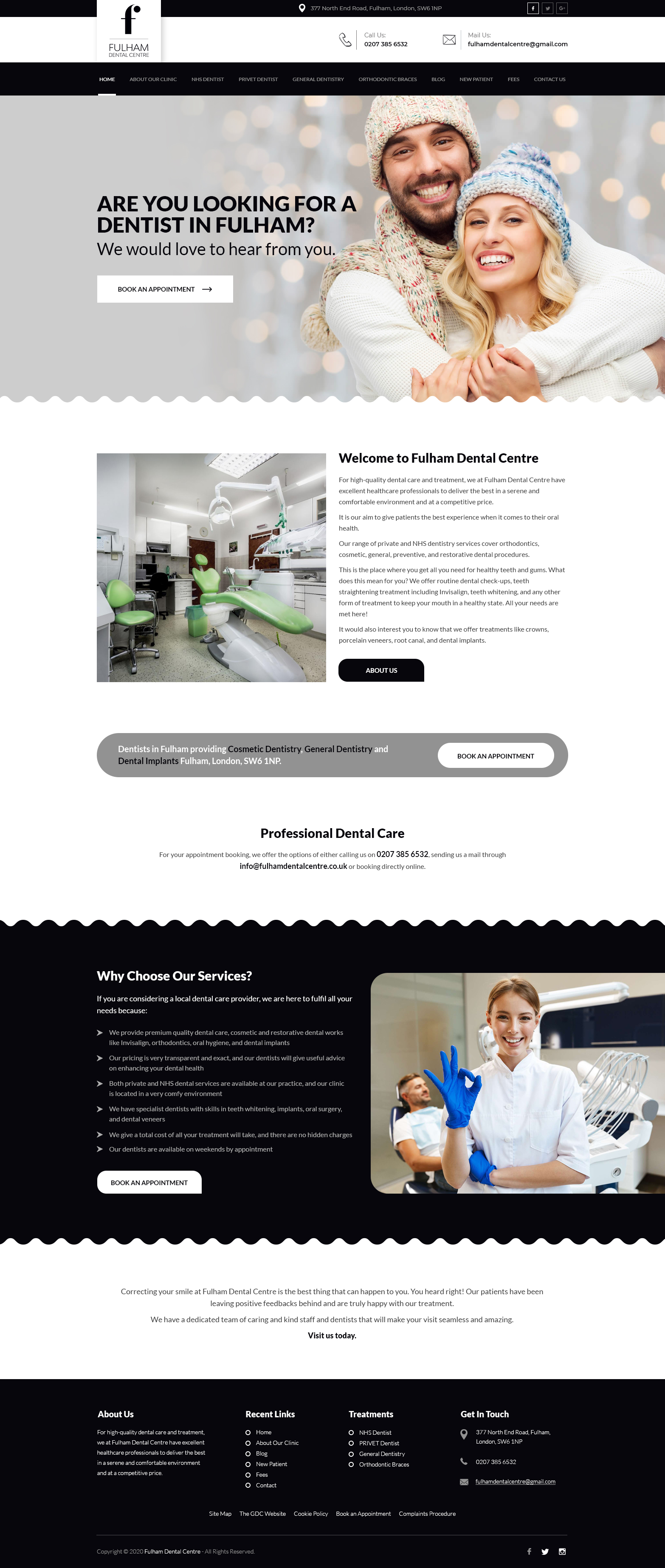
A crisp black-and-white website that mirrors the practice: a warm patient-led hero, clear treatment navigation, transparent reassurance about NHS and private care, and book-an-appointment prompts throughout. Editorial calm, built to convert. Live at fulhamdentalcentre.co.uk.
06 / Deliverables
What weshipped.
A brand, print and web engagement — identity through to the cards in the waiting room.
- 01'f' monogram & logo
- 02Positive & reversed lockups
- 03Brand guidelines
- 04Monochrome system
- 05Business cards
- 06Appointment cards
- 07Stationery system
- 08Website design
- 09Website build
- 10Treatment & booking UX
- 11Patient photography direction