

Brand · Identity · Web
Addiscombe Dental.Quiet confidence,by design.
A renowned NHS and private dental clinic in Croydon — we built a refined identity system anchored by a single elegant monogram, extended across uniforms, stationery and a clean, reassuring website.
01 / The Brief
Renowned caredeserves arefined identity.
Addiscombe Dental Surgery is an established NHS and private dental clinic on Lower Addiscombe Road in Croydon, offering everything from hygiene and Invisalign to implants and veneers. They had a strong local reputation but a dated visual identity that didn’t reflect the calm, quality experience inside the practice.
We built a refined brand around a single, ownable monogram — a serif ‘A’ rendered as one sweeping stroke — and rolled it out across clinical uniforms, stationery, and a reassuring, easy-to-navigate website built to convert local searches into booked appointments.

03 / The Monogram
A mark thatworks everywhere.
The ‘A’ icon was built to stand alone — confident at the size of an embroidered tunic badge, crisp as a favicon, elegant blown up across a business card. We delivered it in positive and reversed forms for total flexibility.


04 / Palette
Duck-egg blueand quiet charcoal.
A soft duck-egg blue gives the brand its calm, clinical-but-warm character; charcoal navy grounds the type with authority. White space does the rest. The result feels clean and trustworthy without the cold sterility of typical dental branding.
RGB 168 · 213 · 208
Signature colour
Type & mark
Stationery ground
Rules & dividers
05 / Applications
The brand,applied.
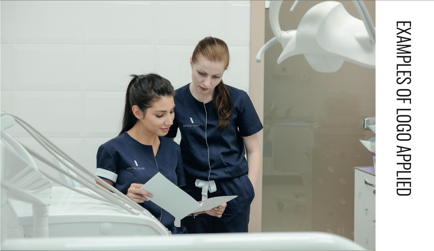
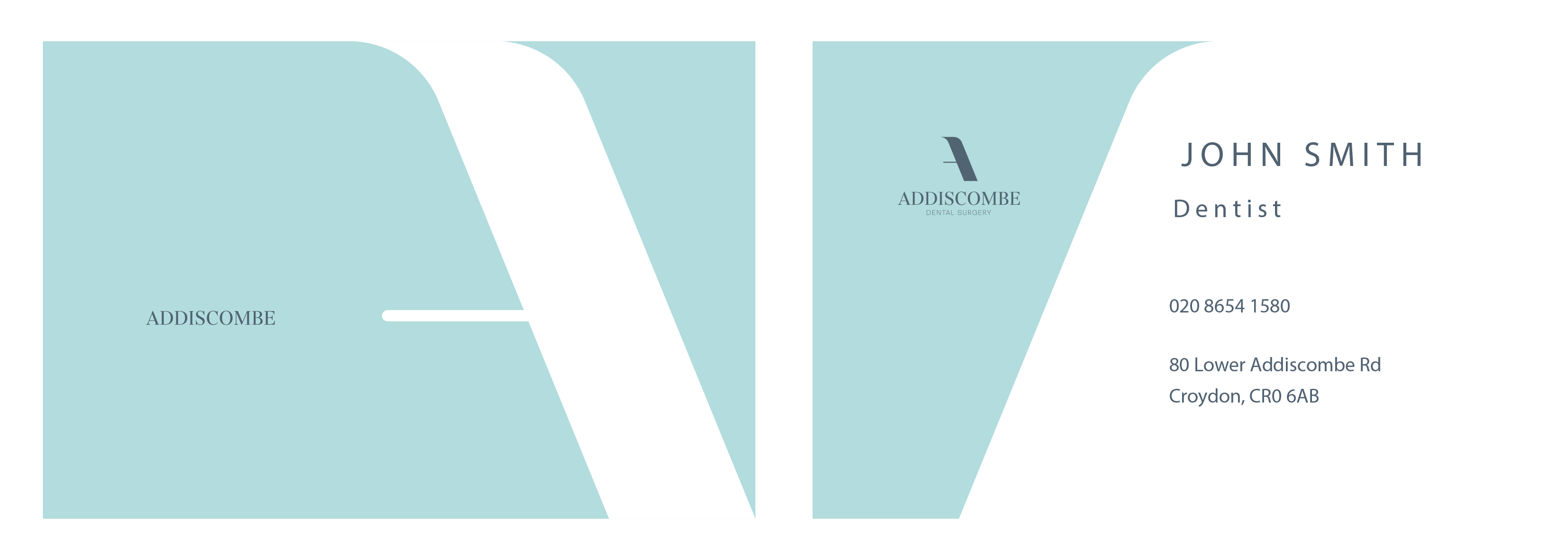
From the embroidered tunics the team wears chairside to the business cards they hand across reception, the identity was built to live consistently across every patient touchpoint.
— A note on the work
The best dentalbranding doesn’tshout ‘dentist’ —it just feelscalm.— Studio note
06 / Website
A reassuringdigital front door.
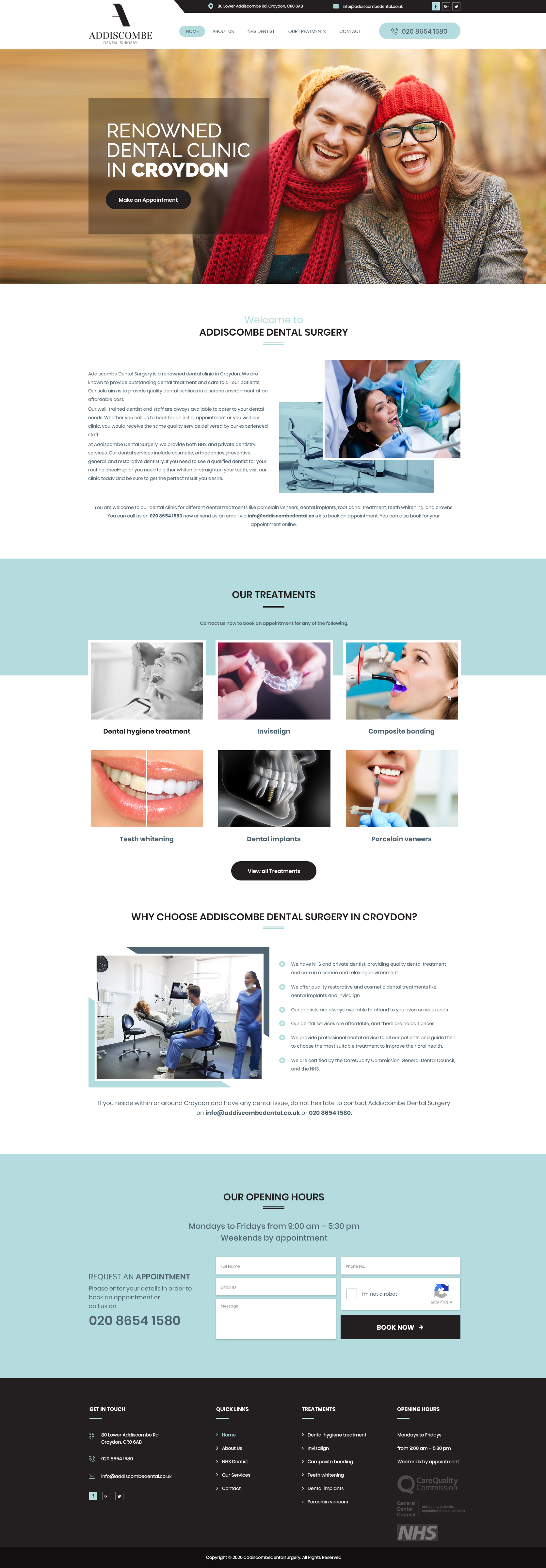
A clean, photography-led website that surfaces treatments, opening hours and a one-step appointment request — built to reassure nervous patients and convert local ‘dentist in Croydon’ searches. Live at addiscombedental.co.uk.
07 / Deliverables
Everythingshipped.
A complete identity-and-web rollout — designed, applied and built by the studio.
- 01'A' monogram
- 02Full logo lockup
- 03Positive & reversed marks
- 04Brand guidelines
- 05Colour & type system
- 06Business cards
- 07Letterhead & stationery
- 08Embroidered uniform branding
- 09Appointment & referral cards
- 10Website design
- 11Website build
- 12Appointment booking flow